
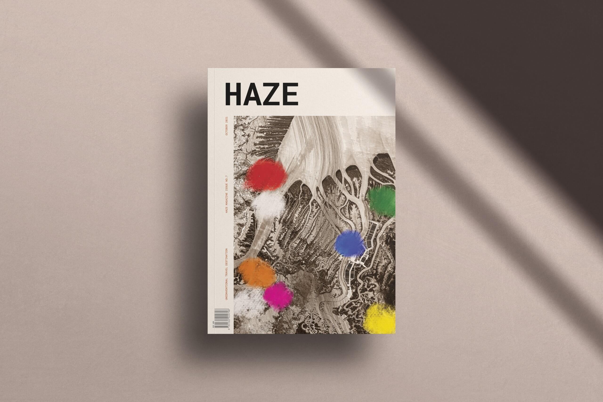
Haze Magazine
Editorial | Typesetting | Art Direction |
Image Treatment | Print
Concept work for a student project
CHALLENGE
Create an editorial design and art direction for the unconventional travel magazine ‘Haze’ that strikes
out against the current trends of design. Utilizing unconventional design to draw in and inspire
potential travellers, whilst encapsulating Africa’s
antiquity and beauty in a refreshed light.
EXECUTION
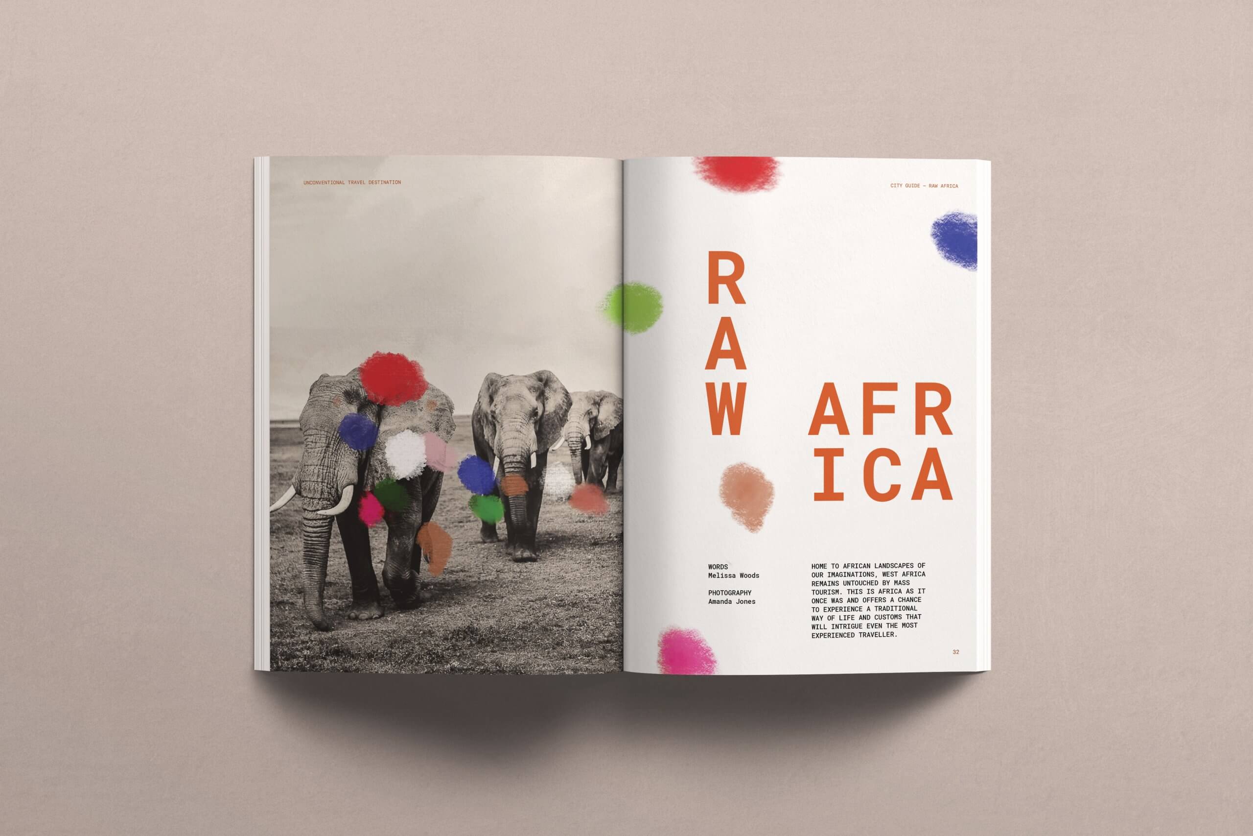
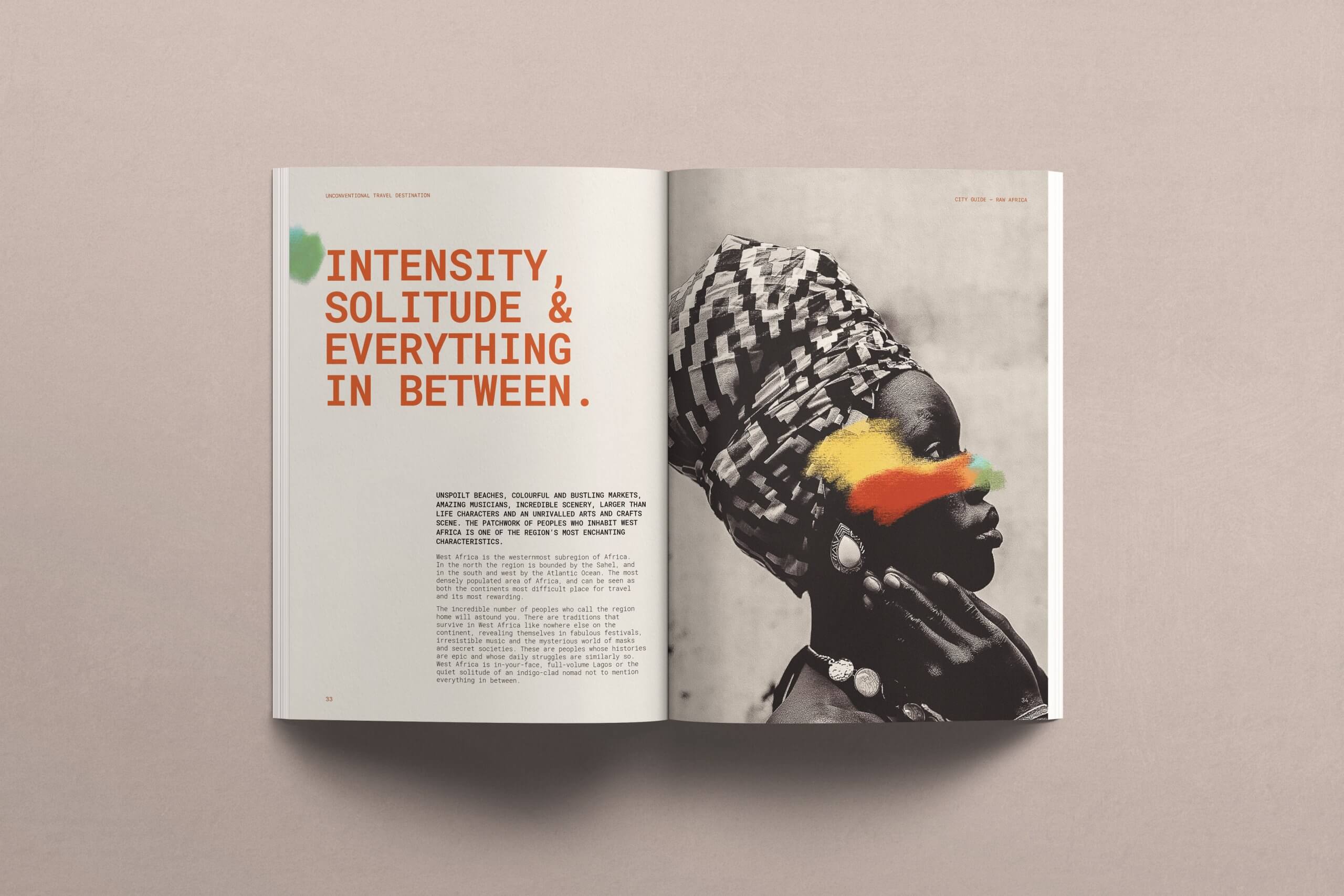
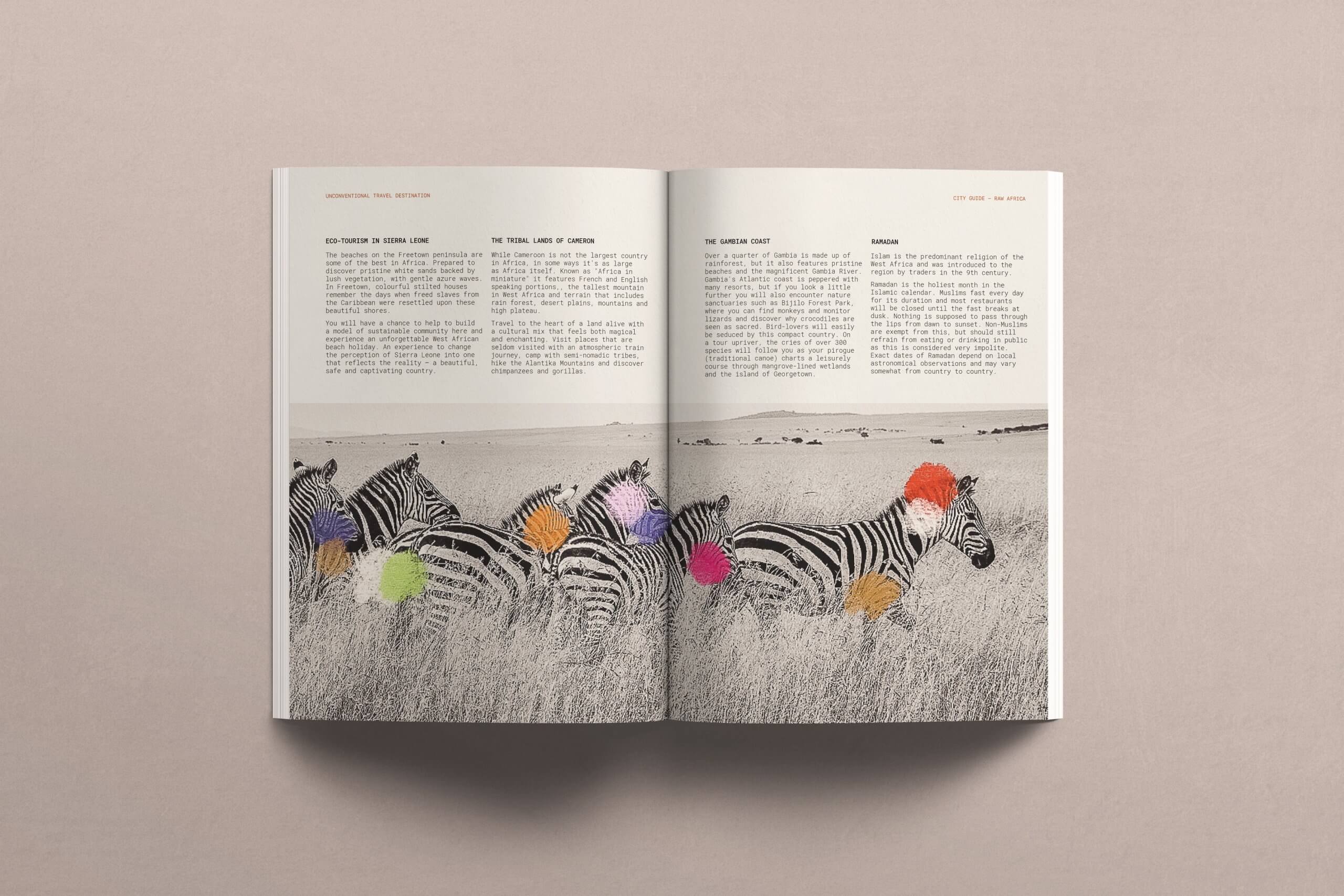
The art direction draws on the depth and boldness of the wildness that Africa offers. I have chosen bold visual imagery in this grungy editorial to draw on the tension between the rawness of Africa and elevated unconventional travel. My photo treatment explores the use of sepia as a symbol of
the Africa’s antiquity, layered with bold coloured chalk, as a representation of more than 3000 African tribes. The layering of these contrasting design elements aims to showcase the parts of Africa the world has yet to look deep enough to see.
“When you have acquired
a taste for the dust,
and the scent of our first rain,
you’re hooked on life in Africa,
and you’ll not be right again.”
Made In
27.4698° S, 153.0251° E
With Love.
CONTACT
Please get in touch for
commissions, questions, or
collaborations:
hello@sydneysu.com
SERVICES
Visual Identity
Photo Art Direction
Web Design
Editorial Design
Packaging Design
Lettering
Content & Marketing Strategy
Wedding Design
SITE CREDITS
Portfolio Photography by
Studio Six N. Five, James Turrell,
Rosie Hardy and Myself.
Copywriting by Amelia Parkin